Killjoys
Killjoys comes from the producers of Orphan Black, Temple Street Productions, and the creator of Lost Girl, Michelle Lovretta. It follows a trio of interplanetary bounty hunters as they chase deadly warrants throughout the Quad- a distant system, on the brink of a bloody multi-planetary class war. The series stars Hannah John-Kamen, Luke Macfarlane and Aaron Ashmore. I worked on the deliverables for this show in various capacities and roles including Art Direction, Designer, and Animator.
Client
- Client: NBCUniversal | Syfy
- Creative Director: James Spence, Calvin Chu
- Project Manager: Tom Choi
- Role: Lead Designer / Animator
- Writer/Producer: Joel Kotlowitz
- Categories: Design, Art Direction, Motion
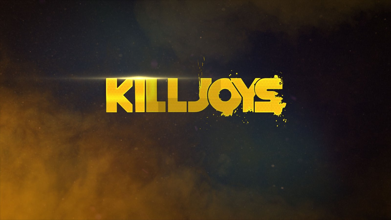
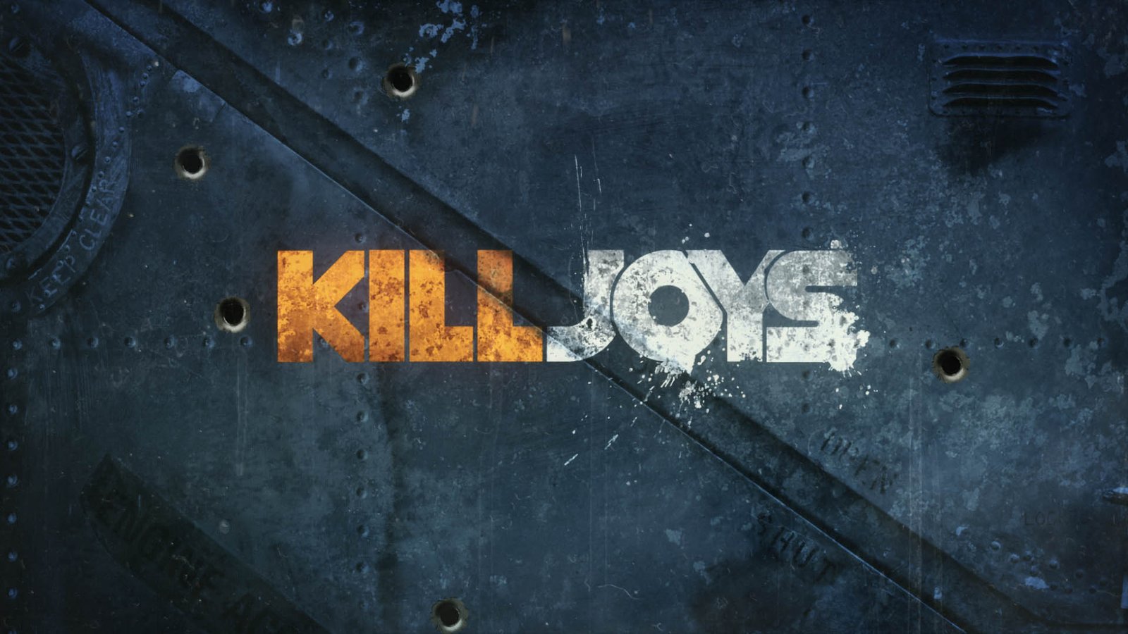
Initially there were several designs and iterations of the tonality of the Killjoys graphic packaging, the VP of Design at Syfy ultimately chose the Neo-Noir direction.
Graphic Novel / Retro Direction (Early Development)
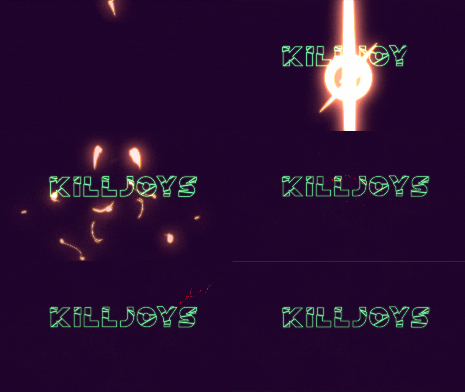
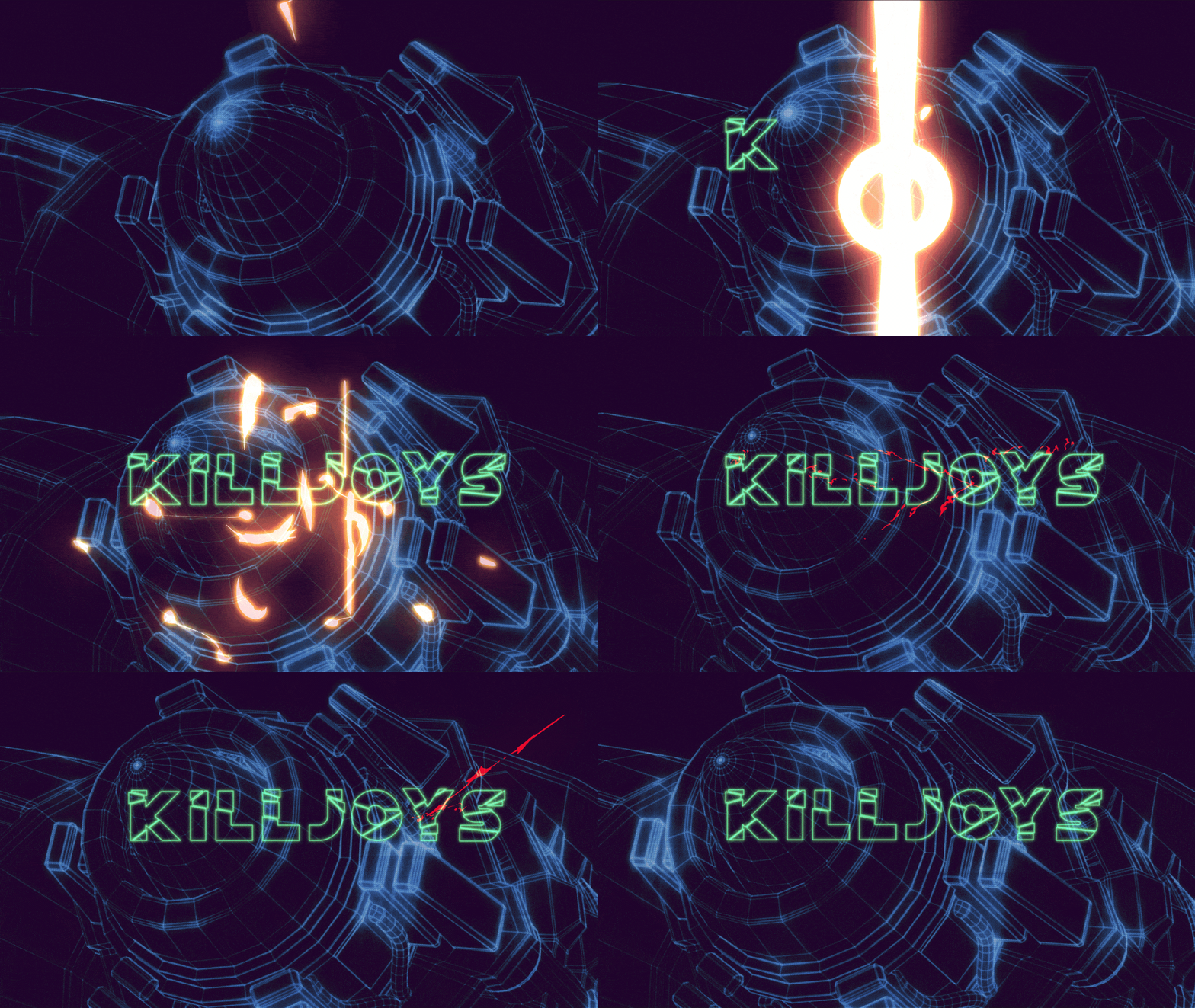
Personally, I was leaning towards the retro-anime packaging, I felt there was something left to explore in utilizing bespoke FX and vivid linework but this was probably the most time-consuming direction of all 3, but perhaps the most rewarding if concepted and executed correctly.
Keyart
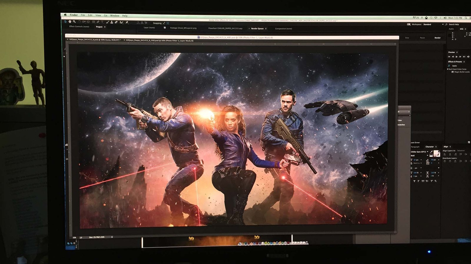
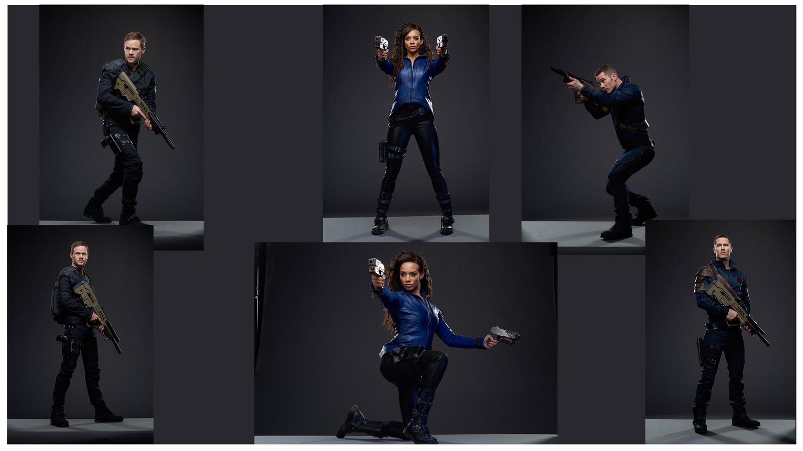
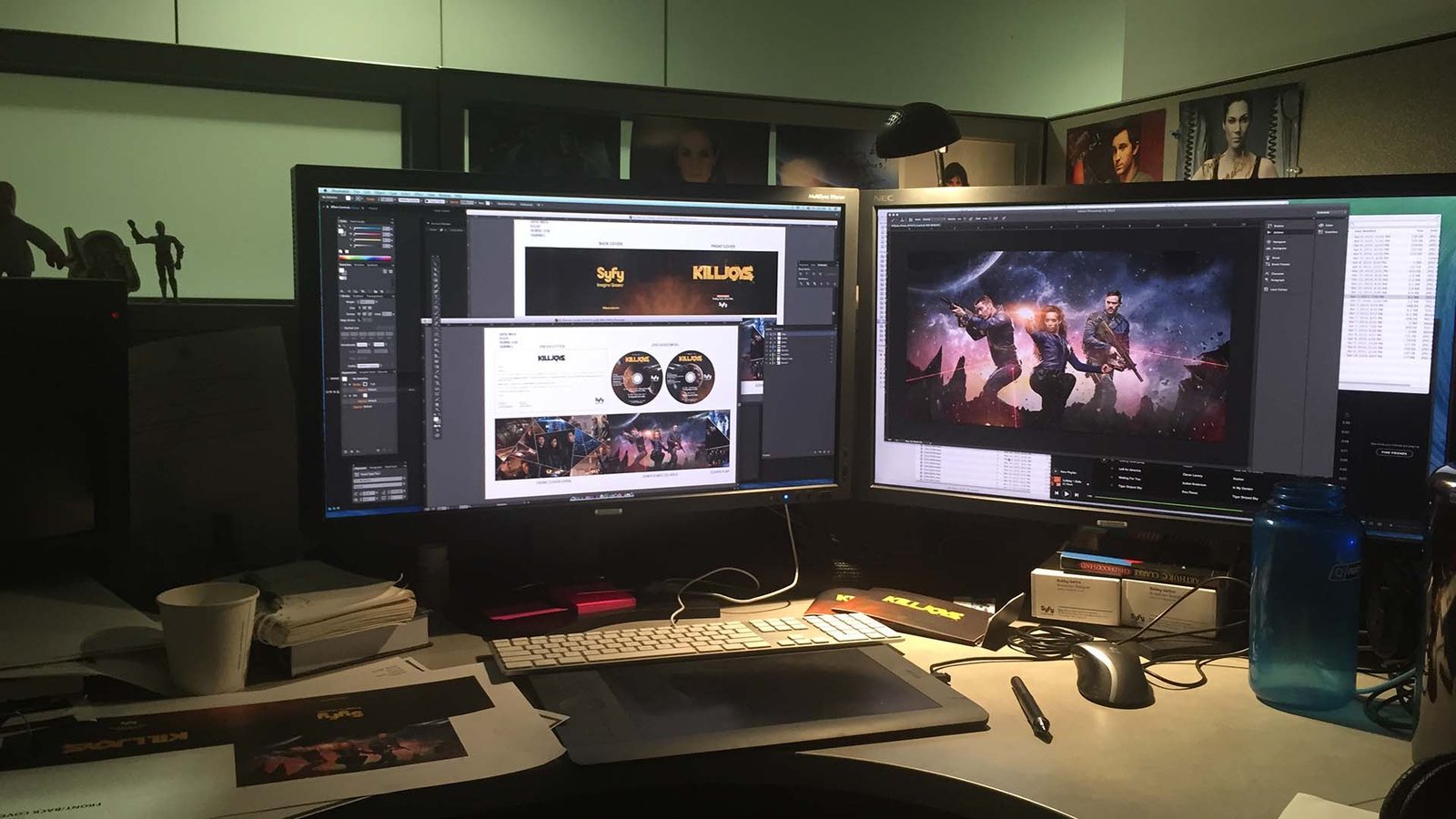
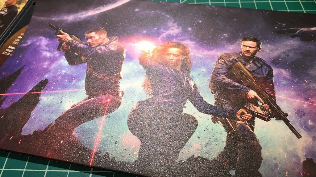
Working on the keyart was the most rewarding of this project. I took the opportunity to ‘brush-up‘ on my photoshop skills and essentially selected press photos to composite a Hollywood-style poster for the launch of KillJoys. The most challenging part was keying/selecting out the hair from the dark-gray background but the overall process of photobashing and painting was meditative. I always relish opportunities to work on deliverables outside my normal process/toolset.
Process
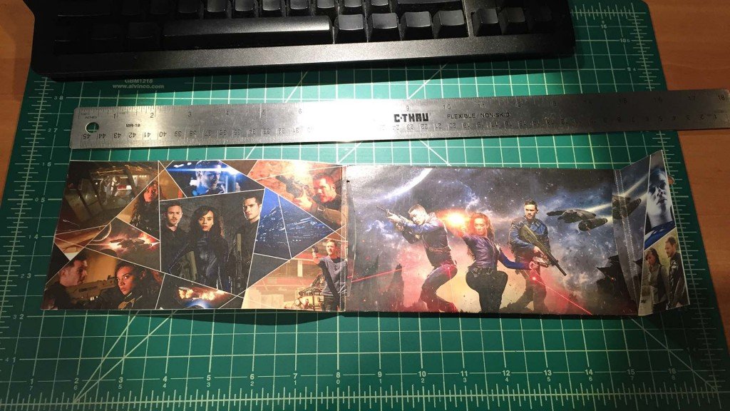
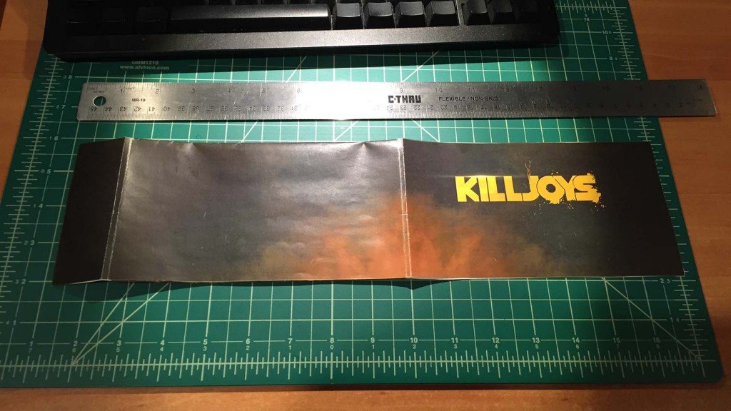
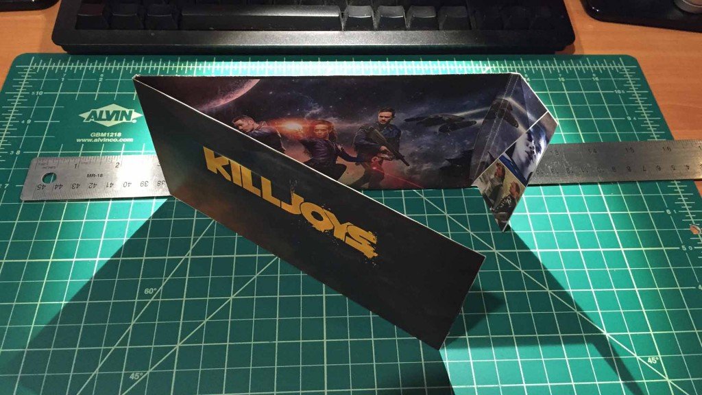
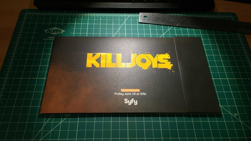
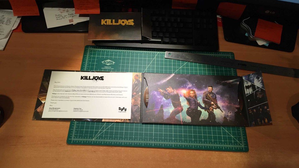
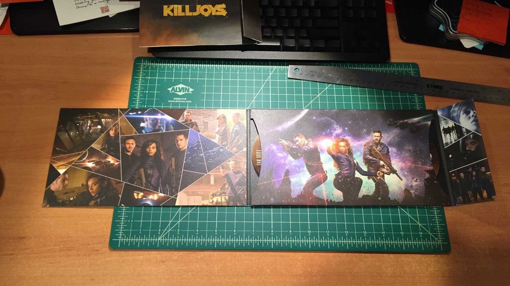
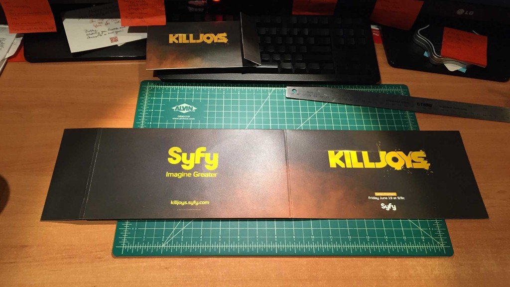
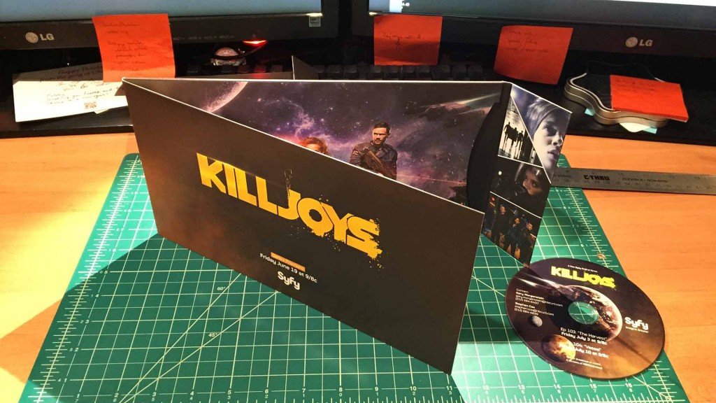
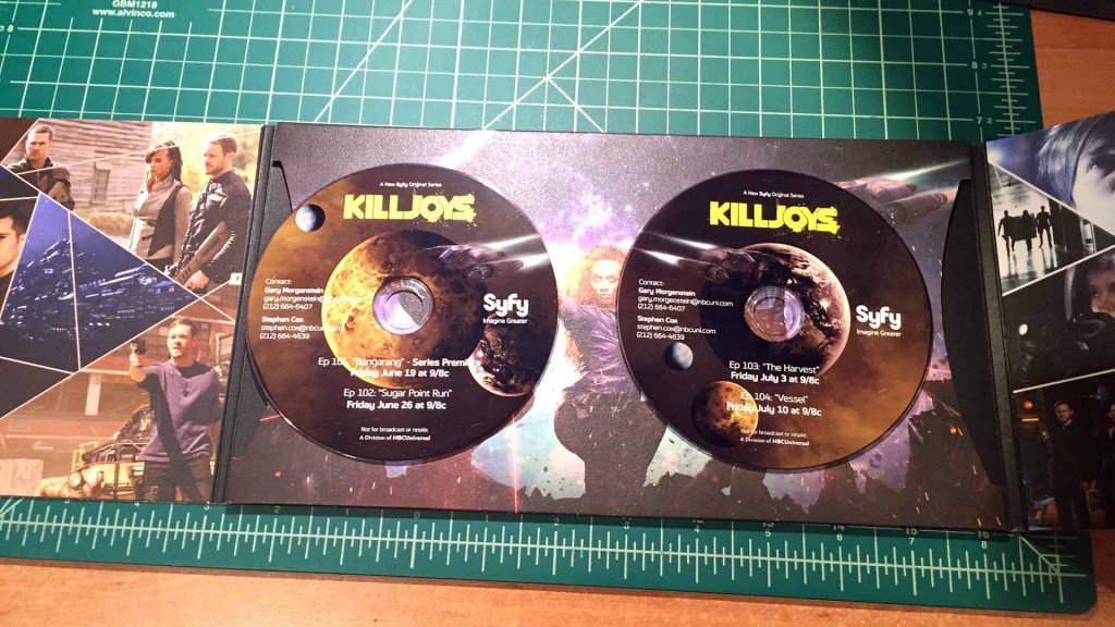
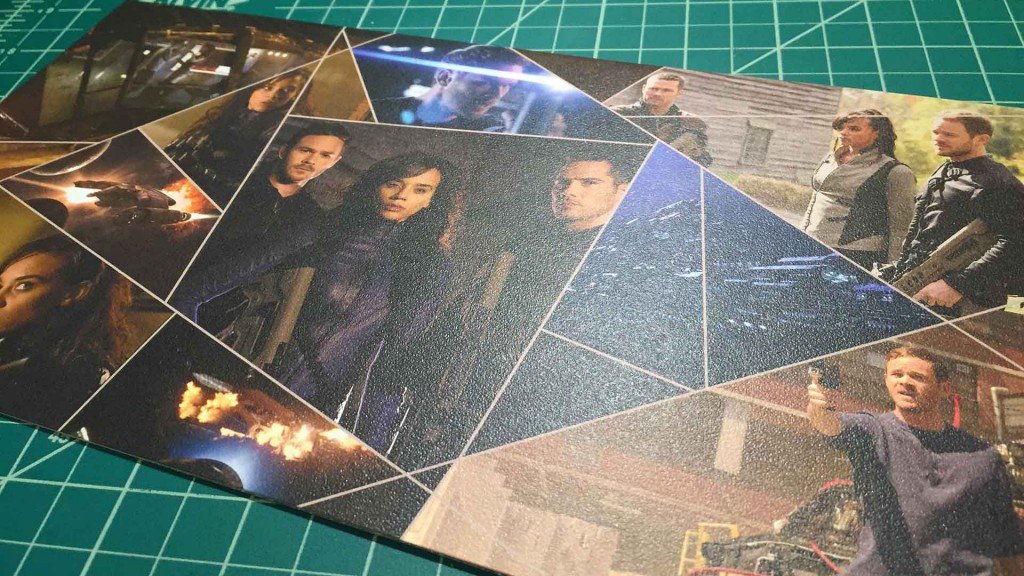
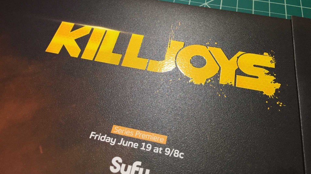
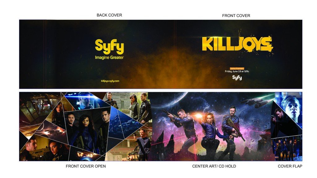
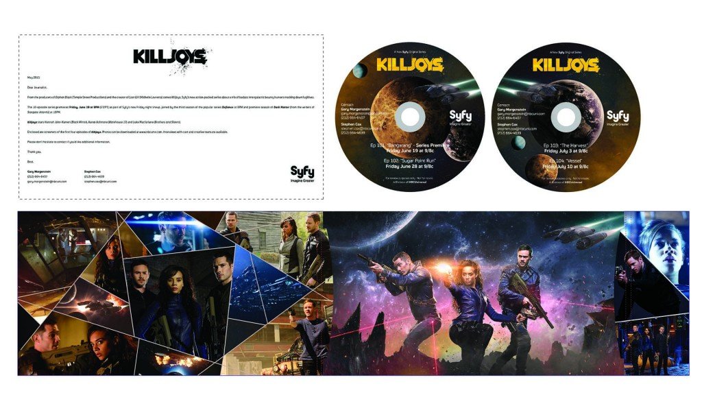
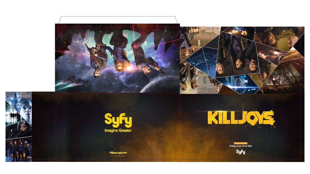
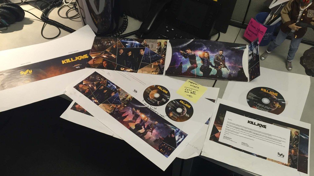
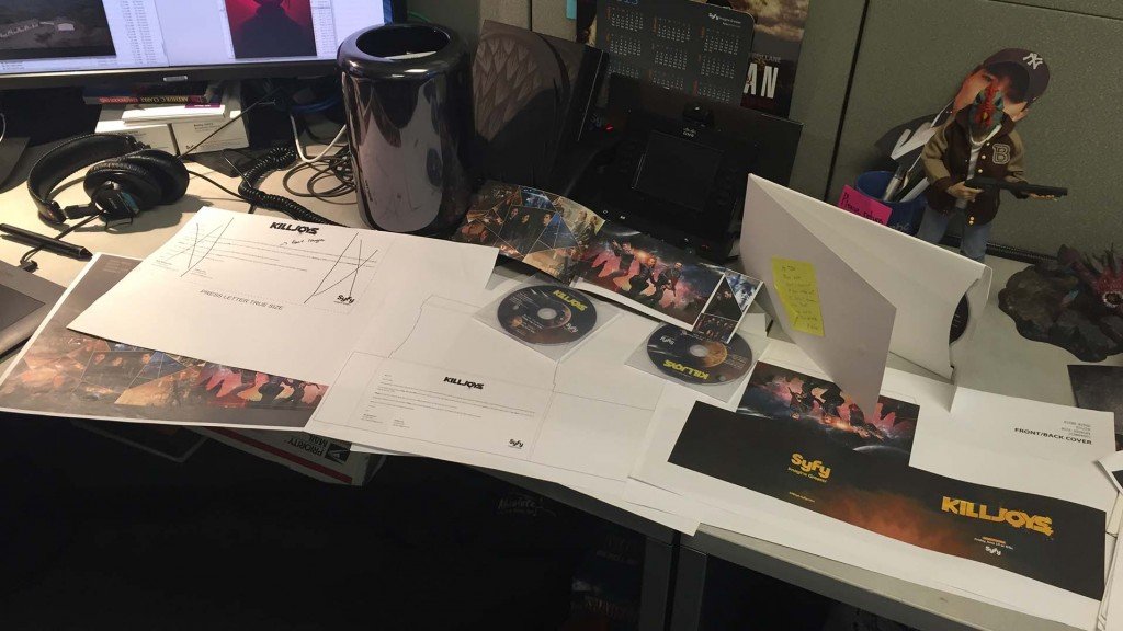
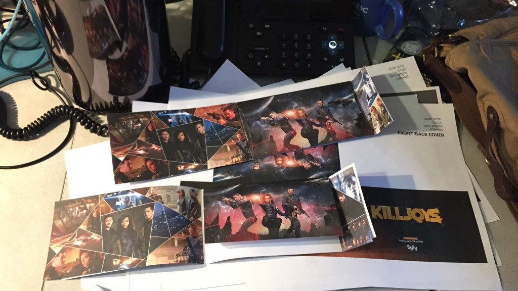
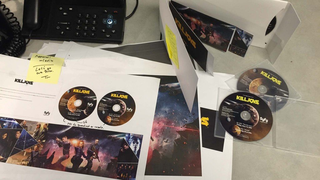
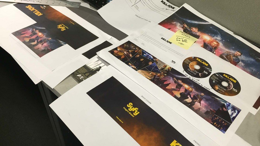
Another aspect of the Killjoys production pipeline was the creation of the press-kit. Working with Calvin Chu, who is an expert in print media, I designed and created the presskit from concept to execution.
Logo / Keyart Development
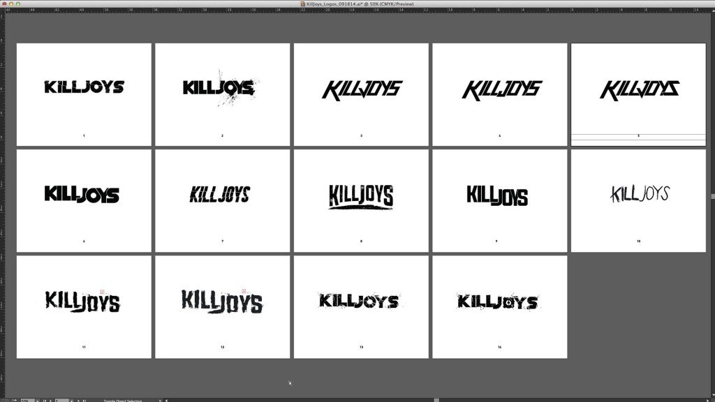
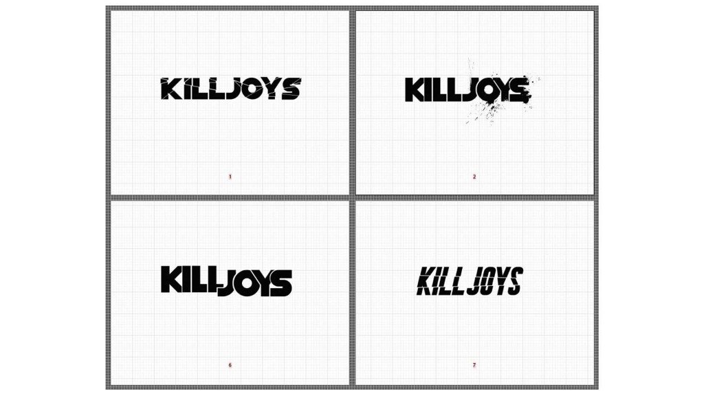
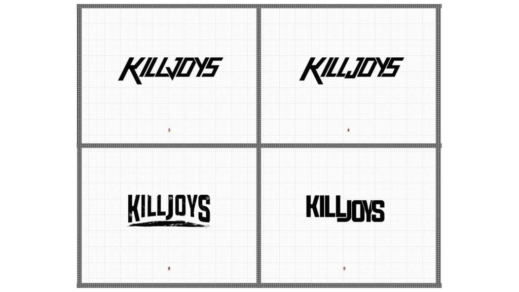
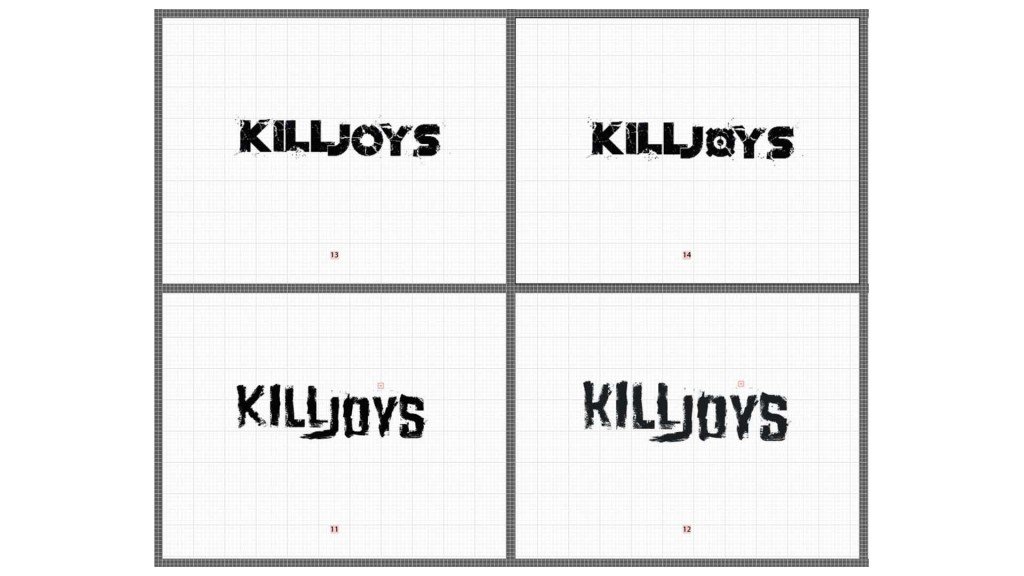
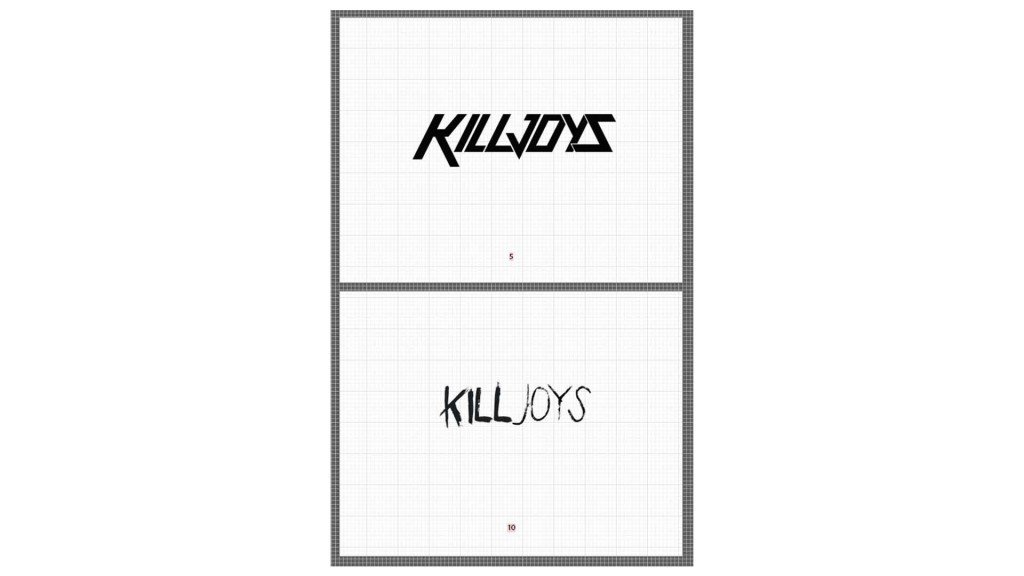
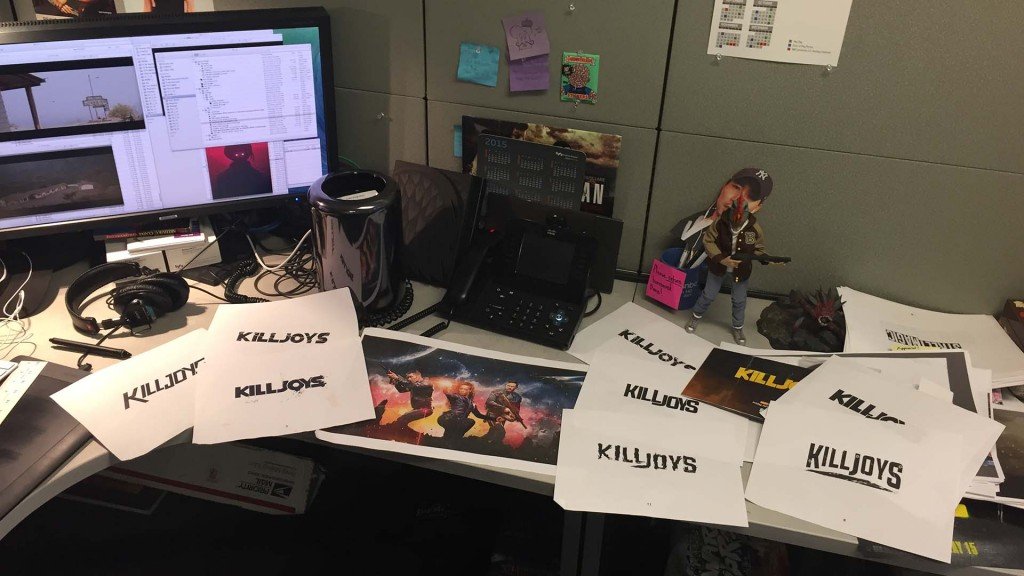
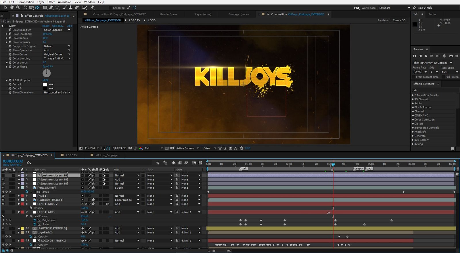
Another aspect of the process that we didn’t gloss over. In broadcast media, show logos are very important and often-times the only public-facing interface between the viewer and the content. It has to be recognizable, yet distinct. I remember researching various logo-styles and designs during the production of Killjoys and it’s nice to see elements of your designs have an influence on other work you spot out in the wild 🙂
Character Promo spots
Other tertiary elements were created for various other promos and packages and passed onto other animators/editors to incorporate as they saw fit. Joel K. did an amazing work writing/editing these Character spots.


